Role: Director of Design and UX
Building Better Businesses
A Proof of Concept (POC) to improve Canadian small and midsize business (SMB) loan application success rates by improving owners’ knowledge and awareness of their finances and understanding the importance of maintaining a healthy cash flow.
The problem was first brought to our attention by subject matter experts (SME) who recognized that when SMBs entered into their third and fourth year of operation, many were struggling to obtain new loans or loan increases due to the total debt exposure they had accumulated – their risk profiles were now too high.
Rejections to seemingly small loan requests were causing CSAT scores to decline and in many cases, clients were closing accounts altogether.

How might we
Increase SMB knowledge and awareness of their finance health in order to make informed loan decisions?

We had 8 weeks to present a functional solution. Dividing the project into 4 two-week sprints in Jira, we conducted stakeholder discovery sessions, ideation jam sessions, and even generated ideas using AI analysis of current customer data.
We interviewed SME stakeholders, conducted user testing and spoke with real business owners to approve, disprove, and discover new ideas and directions.
Primary objectives:
- Support SMBs through the development of a comprehensive financial model
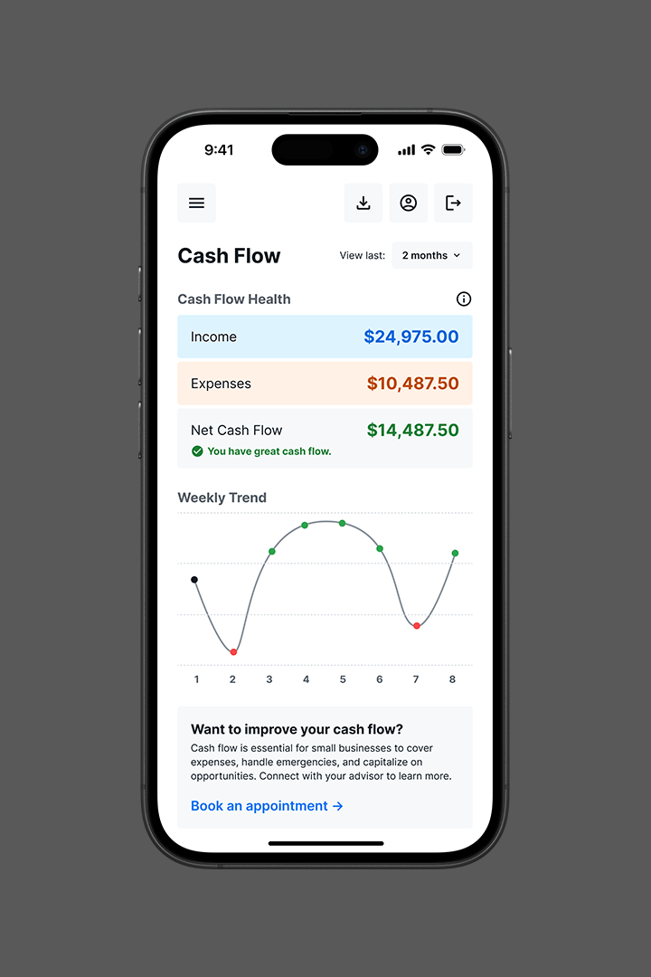
- Visualize transaction data to see cash flow health
- Allow SMBs to generate accurate loan application documentation
Sprint 1
Research & Discovery
In our initial research with stakeholders and data/analytics teams, we learned that business owners were providing poor or insufficient financial data with their loan applications.
- Why was the data deemed poor and what were people doing wrong?
- Did they not understand what they were being asked to provide?

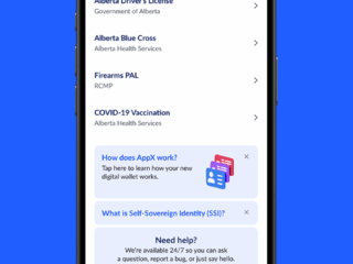
First round solutions gave business owners an aggregated view of their financial landscape by connecting accounts using a technology partner called Flinks. The solution would use artificial intelligence to extract relevant data and apply it to SMB loan application documentation to improve submission quality.
We explored data extraction from documentation via uploaded document or through photo capture. We also explored using AI to pull data directly from transcriptions from human voice inputs.
During interview sessions, we confirmed that business owners had poor financial literacy and didn’t understand what financial models were. They were too focused on other areas of their businesses and relied heavily on the support of friends and advisors to produce the loan documentation.
Discovery
Tech savvy business owners were using AI tools to support their finances.
When we analyzed feedback of our ideas, we concluded that our initial ideas were too complex and that a lack of financial literacy was the real problem. Looking deeper into which areas of the financial model were most problematic, we found that cash flow forecasting was the primary culprit of loan rejections.
This discovery highlighted the importance iterating quickly and regularly seeking feedback. By producing paper prototypes and regularly reviewing them with stakeholders, we were able to produce a solution that best aligned with the problem.
“I regularly use ChatGPT to see how I’m doing… I’m not afraid of giving it my personal information because I know my personal information is already out there, so I might as well use the tools that help me.”—Female, 36
Sprint 2
Definition & Structure
Our product requirements document (PRD) broke down the chosen solution into two primary scope categories: ‘must haves’ and ‘nice to haves’.
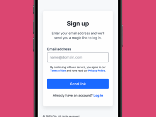
- Must have functionality included: connecting bank accounts, viewing connected accounts, viewing transaction data, viewing transaction categories, document upload, and document export.
- Nice to have features included loan insights, grant offerings, and advisor booking.


We explored using generative AI tools to produce early-stage visual wireframes.
Using AI to generate these artifacts was exciting to test and we found that AI can be a great tool for producing text-based outputs such as personas, user journeys and page content.
However, very few tools allowed us to quickly and accurately produce visual outputs that met our expectations.
I tested over a dozen AI tools for wireframe generation, but found that most were simply shoehorning AI chat interfaces into traditional design interfaces, resulting in a disjointed experience – it doesn’t align with how humans solve problems.


Sprint 3
Testing & Validation
In a fast-paced environment like a startup, teams will often omit user testing due to having higher priority objectives, tight deadlines, or simply because they don’t think about it (or care).
Regardless of the team size or skill sets, user testing should be performed at every stage of a project.
Tests can be performed quickly and easily using a small number of participants, often friends and family, and can provide significant value and insight into ensuring solutions are understood and usable.

Audience criteria:
- Canadian small business owners (1-50 employees)
- Had a loan rejection in the past two years (<$50,000)
- Actively used accounting software (QuickBooks, Xero, etc.)
- Deemed themselves tech savvy, but not financially literate
For our first round of testing, participants were asked to evaluate various designs and rate them against content hierarchy, language and messaging, interface functionality, and overall complexity.
Important note: Data being displayed was merely a snapshot of a singular moment in time. It required historical data to perform effectively. Since it did not take into consideration extraneous values and understanding that expenses are typically withdrawn early in the month and income typically comes in near the end, it was important that our AI solution accounted for this understanding.
For example, you could have 4-5 weeks of negative cash flow in a row, but suddenly get an influx of income that swings the status into “healthy”, contrary to the trend. When viewing mid-way through a month, trend will be unhealthy until income balances it out.
Test 1
Evaluate participant’s understanding of the content, language, data, and overall complexity.

Assumptions:
- Background colours for income/expenses helped people better associate the data within the chart
- Health callout gives a target to works towards
- Time frame filter was easily recognized
- Chart displayed just the right amount of data
- Less is more (minimal labels and support)
- Users understood what an expense ratio was
Results
- Users appreciate the visual connection using colour
- Having the advisor callout directly connected to the health was positively received, but the advisor support question felt inappropriate due to users already using the app and feeling it was important
- Users misinterpreted time frame filter as being “millions” of dollar)
- Users wanted more data (ie. see weekly values by tapping bars)
- Users desired supporting headlines such as “cash flow health”
- Users assumed that the higher the expense ratio number, the better
“Without labels, I can’t tell what I’m looking at. Sometimes having fewer elements on the screen doesn’t make it simpler, it makes it harder for me to understand.”—Female, 39
Test 2
Evaluate participant’s preference for layout, elements, colour, and iconography.

Assumptions:
- Balance sheet layout would be easier to interpret
- Use bright colours to evoke emotion and prompt action (if required)
- Condensed time frame filter was more of a setting than an active tool
- Removing all extra content would make the data easier to read
- Top-down hierarchy reduces cognitive load
Results:
- Simple math equation was preferred over expense ratio
- User of colour help direct action and evoke emotion (ie. green felt positive and encouraging)
- Drop-down menu was simpler and more intuitive. Users wanted to “set it and forget it”
- The larger the chart, the better
- Top-to-bottom was preferred over left-to-right eye scanning
“I guess an expense ratio makes sense, but do the math for me so I don’t have to. I want to know right away what the result is.”—Female,36
Sprint 4
Conclusion
Sadly, not every project gets to see the finish line.
Due to an unexpected organizational restructure, this particular project was not completed during my tenure. However, the team saw our product idea as valuable and impactful for Canadian SMBs and were fully invested in the process and delivery every step of the way.
We were proud of what we were able to accomplish in such a short time and felt positive about the results, especially knowing that future projects would benefit from the utilization and application of our experiences, discoveries and lessons learned.
All designs outlined above are the exclusive intellectual property of ATB Financial and may not be saved, copied, shared, or reproduced in any form.