Role: Principal Product Design Manager
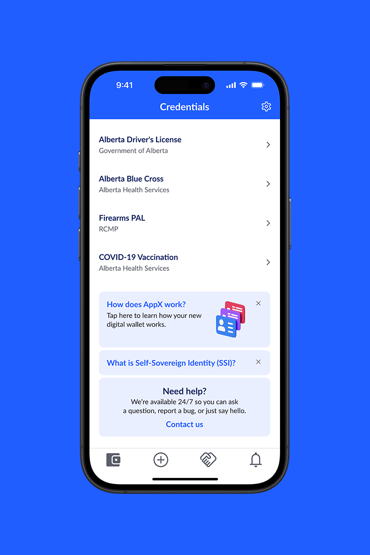
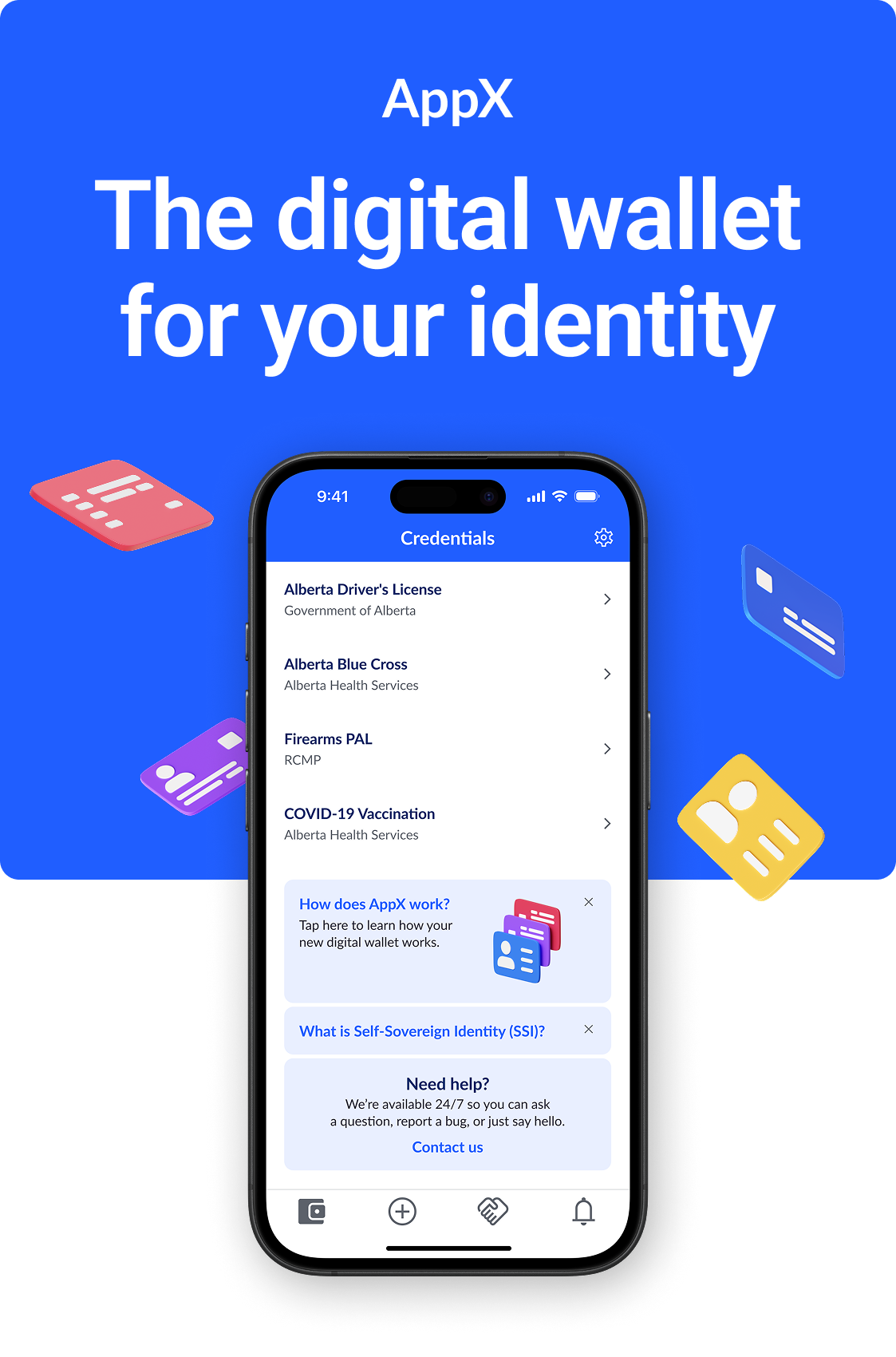
Digital Credential Wallet
A B2C mobile wallet application, AppX transforms paper credentials into reusable digital credentials, allowing users to easily manage, grant, and revoke access to personal information such as bank accounts, licenses, insurance, etc.
Although it was paving the way for the future of zero-knowledge proof applications, it had failed to support a broader portfolio of identity products and was unsuccessful at retaining new users.

How might we
Overhaul the onboarding experience, usability structure, and accessibility in order to build trust and improve retention with new users?
People before product
Design and user experience are imperative factors in determining the success of a product in today’s market. Users have increasingly high expectations for quality and ease of use, so it’s important for an app to do more than just solve a problem – it has to work intuitively, be accessible, and connect with people emotionally.
Successfully completed objectives:
- Redefined the product’s brand and established a new set of visual guidelines.
- Developed a scalable component library that met WCAG Level 2 standards.
- Eliminated repetitive and unnecessary steps to improve onboarding, task completion, and way-finding.

UX Audit
How’d we get there?
I led a comprehensive usability audit of our product, mapping out every screen of the experience in an effort to highlight as many areas for opportunity as possible. Although many were discovered, we narrowed our focus down to three key opportunities.
Opportunity #1 – Content hurdles
Unnecessary steps and repetitive messaging were slowing users down.
- No clear mapping of information architecture.
- Poor presentation of legal documents.
- Asking for unnecessary personal data.
- Repetition of contextual messaging.

Opportunity #2 – Cognitive challenges
Experience did not align with user mental models and caused confusion.
- Non-compliant with modern accessibility standards.
- Supporting visual graphics looks like functional UI.
- QR code scan target was difficult to achieve.
- Canvas movements were not complying with expected behaviour.

Opportunity #3 – Technical language
Misleading messaging and lack of label consistency resulted in frequent user error.
- Undeveloped brand guidelines and no active design system.
- Improper assignment of functional labels such as “back”, “exit”, “close”, and “cancel”.
- Use of paragraphs where a concise label would suffice.
- No language or visuals that conveyed safety and security.

User Journeys
Pathway discovery
To better understand the challenges our users were facing, we reviewed the steps of our primary journeys. Since they hadn’t been developed in detail, I led the development of two identified personas based on the primary touch-points of our product.
Introduced Users
Existing banking customers who were offered AppX as a faster and safer solution to KYC verification. With client KYC experiences remaining relatively unchanged for many years, users were initially excited about AppX.

Discovered Users
Non-banking customers who desired a safer and more secure method of managing their digital identities. They are early adopters who aren’t afraid to take risks and would place significant value on a product’s first impression.

User Flows
Pathway alignment
We identified the most important phases of our user journeys and remapped the flows to resolve the primary hurdles. We then compared those flows against all of the decision-making points for each user.

The product had a lot of bloat – unnecessary steps and decisions points – slowing users down and frustrating them. Working collaboratively with product and engineering, we mapped out the primary flows (ie. onboarding) and resolved the roadblocks to create a cleaner and more intuitive way-finding experience.

Shown below is an exploration map of how credentials in the wallet could be re-categorized to improve way-finding. Since many credentials had overlapping attributes, it was possible that a credential could live in more than one category, making it difficult for users to follow.

Research & User Testing
Real people, real results
Our user testing results validated some assumptions and disproved others.
Testing uncovered that while onboarding experiences are expected by users, they are interpreted as necessary hurdles, which meant that they were not always happy about them.
Expectations
What elements are users already familiar with?
What are they looking for?
What assumptions are they making?
62%
Preferred longer onboarding
Emotions
How do users feel about onboarding?
Do they understand each step?
Are they building trust with us along the way?
61%
Opted to skip reading T&Cs
Effectiveness
Are we effectively communicating the tasks?
Are we ensuring value is achieved along the way?
Are we offering the proper actions?
50%
Chose biometrics over passcodes
Experience length
Evaluated whether various stages were put into question by users.
In this scenario, we tested how users responded to being offered the option of selecting a preferred method of authentication and giving us personal information.

Results
- Shorter isn’t always better. 61.9% of users preferred the longer experience – it helped them build trust.
- Authentication is personal. 50% of users chose Face ID while the other 50% chose Passcode – understanding of tech played a role here.
- Age affects experience. The older the participant, the more likely they were to spend time absorbing content before making a decision.
- Offer a contextual way out. When presented with the T&Cs, users liked having the option to skip – it gave them a sense of power and control.
- Expect the expected. No users questioned being asked for personal information – they felt it was commonplace to provide it.

Takeaways
Expectation vs Reality – Users have assumptions about onboarding flows based on past experiences, so when we deviate from that expectation, we need to be explicit about why.
Data sharing – Many users have come to expect that an application will ask for personal information up front (name, email address, phone number) and are not concerned with sharing it. But the request must still be intentional and have purpose.
Human-centered design – Users desire constant affirmation that the process is going smoothly, so we need to make sure we’re including appropriate messaging that supports tasks and actions.
“I like when I’m given options, like Face ID vs Passcode. It makes me feel like you have my interests at heart and are not just looking out for yourself – you’re looking out for the customer.”–Female, 46
Steps and actions
Evaluated how users interacted with and felt about our onboarding experience.
Using results from the first test, we created a second test to better identify areas of struggle. We also tested our users’ knowledge of the industry in which AppX was being actively targeted.

Results
- Education was key. When viewing the welcome carousel, 62% of users did not know what a digital credential was.
- Provide options. 77.8% of participants confirmed that they read welcome screen messaging while 22.2% stated that if given the option, they would skip it.
- Safety is important. When asked how they felt about using an app that required biometric security instead of a username and password, a majority leaned towards the more positive end of comfort.
- Assumptions made. All participants assumed that the T&Cs are the same across all apps.
- Design for all. Older participants (50-65+) required more intuitive UI, while younger participants (18-34) had no trouble navigating a broader range of UI styles.

Takeaways
Less is more – We need to ensure that each screen has just the right amount of direction and that cognitive loads are kept relatively small. Young users move quickly and are willing to fail, so we need to support them with the appropriate UX.
Education is key – SSID and biometrics are still quite new for a lot of people. Many users questioned the lack of 2FA and missed the digital identity messaging early on. There is an opportunity for us to build trust and meaningful relationships with our users through transparent communication.
Honest communication – There is an assumption that a digital wallet is meant for finance/crypto, so we need to make sure we’re clearly communicating the purpose and value of our wallet – digital identity now, everything else later.
“I believe this is pretty standard for something like a digital wallet and I feel more comfortable using an app that requires it [biometrics].”—Male, 26
T&C presentation
Evaluate user’s thoughts and feelings toward T&C presentation styles.
The biggest pain point to come out of our second test was the T&Cs. For our third test, we sought to determine the best method of presentation by showing users three different styles; Full, Progressive, and Doorway.

Results
- Innovation over tradition. 61% of users opted to skip the T&Cs in the Full presentation.
- Emotion over simplicity. 44.4% of users felt unhappy about the Full presentation style.
- Support the people. 83.3% of users said ‘Yes, I would read it” when shown the Progressive presentation, with 94% of all users stating that this was their preferred experience.
- Don’t hide anything. Nearly 90% of all users said they would opt to skip the terms in the Doorway presentation and additionally, 50% of all users felt that this presentation style was “untrustworthy” and “suspicious”.
- Keep adding value. Overall complexity of an experience is of no concern to users who are receiving value along the way.

Takeaways
Transparency builds trust – There is a strong desire for companies to better communicate with users how their relationship with an app will be monetized. Presenting terms and agreements in an accessible way is one step towards creating and delivering value.
Accessible design creates transparency – Small fonts and large, run-on paragraphs create an immediate lack of trust and suspicion. Putting more effort into translation and presentation will give users more comfort in the relationship.
Effort where it matters – Putting effort into building positive relationships with our users will go a long way. They’re smart and can tell when we’re cutting corners and there is a lack of effort. We have an opportunity to differentiate ourselves through these efforts.
“I have more trust towards apps that show me all of the terms and allow me the option to skip. Put the power into my hands to make those decisions – don’t make them for me.”—Male, 39
Opportunity
Build trust and show value quickly by reducing friction and providing options.
UX/UI Challenges
Solving the complex
For a product to be truly innovative, teams must tackle the complex problems that have a big impact on the end user experience. In many cases, the process is a constant evolution as technology and user expectations change.
Solving complex problems means asking a lot of questions.
Through strong cross-functional collaboration and stakeholder engagement, we found a balance in pairing functional requirements with appropriate UX messaging and communication.


Biometrics
In order for us to deliver a truly passwordless experience, we solved how to deliver the right message and actions based on the varying capabilities and technical limitations of their device.
- If the user has already set up biometrics and changes them later, how do they authenticate?
- If a user removes a biometric profile or changes their device, is there a fallback method?
- If the user fails their biometrics a set number of times, what happens?

Credential Lifecycle
Credentials are not static and are ever-changing, so we solved the front-end design to help users easily identify which phase of the lifecycle their credentials were in.

Proof Requests
With the constant evolution of a credential, we solved how to determine which credentials were available to users when actioning a proof request (a third party requesting access).

Design Systems & Accessibility
Putting it all together
After leading a comprehensive competitive analysis against our competitor landscape, we learned that all of our competitors showcased the same UX/UI issues, indicating that product solutions in our space were being primarily guided by bias and assumptions.
This understanding was important because it guided us towards creating a more intuitive and delightful user experience that would stand out in market.

We enlisted a partner agency to develop a fun and exciting new brand. One that spoke to a younger audience and used 3D imagery that we had identified in our competitor analysis was unique to the market.

I led the development of a new foundational design system for the lab that would enhance our design and engineering relationship and allow all new products we developed to receive the same modernized and accessible treatment of their UI.
Using the surface overlay methodology in Material Design, we defined light and dark mode appearance styles. We also made sure that every colour combination across both modes met WCAG 2.1 Level A and Level AA success criteria.


It was important to us that our icon family was scaleable and easy to implement, so we opted to utilize the Material Design font library for its robustness and scalability.
Lastly, we created individual style libraries in Figma that could be applied to the components of each product. This allowed both designers and engineers to quickly and easily transition new concepts and ideas into production-ready components.
Conclusion
Expect the unexpected
Sadly, not every project gets to see the finish line. Working on a 0-1 product means shifting gears and adapting quickly. At 60% completion, our executive team decided to realign our resources towards our B2B SaaS offering in order to grab hold of a new market opportunity.
We were proud of what we were able to accomplish in such a short period of time and the impact of our work was already showing.
Speed and efficiency increased
We successfully launched our design system which improved the delivery times of ideation and design artifacts across all stages of the labs product funnel.
User testing expanded
We increased the rate of user testing for subsequent projects across the lab, ensuring the voice of the customer was always at the forefront of new work.
Team members upskilled
We grew overall team member confidence in their ability to jump into collaborative programs like Figma and Google and use those tools to support their workloads.
A short period of time later, our products caught the attention of a buyer and the underlying technology was acquired.
All designs outlined above are the exclusive intellectual property of ATB Financial and may not be saved, copied, shared, or reproduced in any form.