Role: Director of Design and UX
Identity Verification SaaS
Oliu is a B2B2C layered identity verification SaaS that gives organizations the ability to create and manage verification transactions for their customers.
Originally developed as a credential management platform, the product onboarding experience had high-drop off rates resulting in a failure to generate recurring revenue.
Below are screens from the original flow.

How might we
Redesign the onboarding experience to improve success rates and increase revenue?

Value drives outcomes
When signing up for a new product or service, a user needs to perceive value at every step. Doing so builds trust.
In order to build trust through value, its important for people to understand the purpose of every step and action; why they’re being asked for personal information, how the information is being used, and how security and ownership is handled.
Successfully completed objectives:
- Clearly communicated steps and actions
- Utilized a modernized method of authentication (passwordless)
- Improved the overall time-to-value
Testing
Out with the old
An onboarding experience must be easy to complete, or the product can be at risk of losing potential customers and negating growth and marketing efforts.
My team worked with stakeholders to break down the old onboarding flow and construct a new MLP (“Minimum Lovable Product” – a term joyously used by the team).
Questions we asked:
- How long did the onboarding process take?
- What were the key points of failure?
- What was the minimum information required to onboard?
- What were the initial entry points? (organic, by invitation, etc)
10 Steps @ 3:34
Tests determined that we were requesting too much information and that one specific step was resulting in high drop-off rates.
Visit website
00:00
- Click “Get started”
Create an account
01:30
- Fill out personal information
- Fill out company information
- Fill out payment details
Receive login credential
01:34
- Navigate to the app store and download credential wallet
- Onboard to the credential wallet
- Use wallet to scan first QR code
- Accept credential into wallet
Authenticate
00:30
- Use credential wallet to scan second QR code
- Authenticate login request
Data received from our Sales team highlighted that customers were having issues with delays in receiving the login credential to their digital wallet.
We conducted tests and confirmed that the average time to receive the initial connection request was 23 seconds from the initial scan of the first QR code to receiving the login credential in the user’s digital wallet.

This outcome was less than ideal for our desired experience, so we replaced it with a new OTP (One Time Password) method, magic links, sending a unique login URL to a user’s email address that when clicked, authenticated them directly into the product.
Minimum Lovable Product
In With The New
Unless users are required to pay for your service up front, do not ask for payment details during onboarding. Giving up personal payment information when not required will deter potential customers.
We chose instead to provide access to a limited sandbox environment for free, only asking for payment details when users were ready to expand their access. This allowed our users to make more informed decisions about becoming paying customers.
4 Steps @ 00:40
Initial tests against the new flow proved positive.
Visit website
00:00
- Click “Try for free”
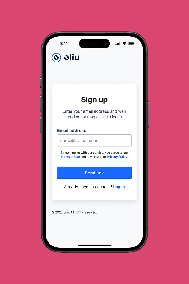
Enter email address
00:05
- Fill out email field
Click magic link
00:30
- Navigate to email and click link
Enter company name
00:05
- Fill out company name field
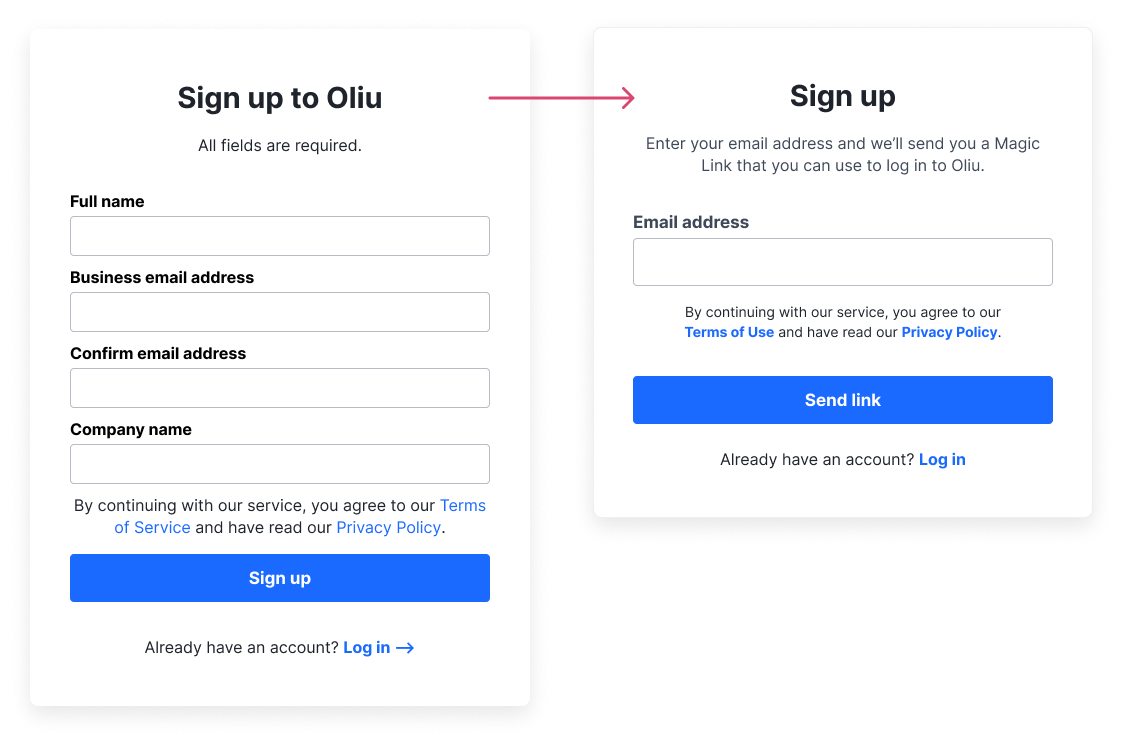
Through ongoing cross-functional collaboration between product, design and engineering, we determined there were only two necessary pieces of information required for someone to use our product:
- Email address – Method of delivering a magic link for user authentication
- Company name – Method of contact for customer success and sales outreach teams
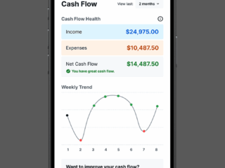
Putting our newly established Figma style library to the test ensured consistency and a cohesive experience. Read my AppX case study for more information.
Use Cases
Supporting the user
When building out a user flow for any new website or application, ensure you design for every possible outcome. This is especially important in early and mid-stage products that are trying to obtain new customers.
Working closely with engineering, we answered key UX questions:
- What happens if the user leaves mid-way through a specific task?
- What happens if they wait too long before moving on to the next step?
- What happens if they try to repeat a task in rapid succession?
- What happens if they click before something finishes loading?

We solved for as many use cases as possible, ensuring our users could confidently navigate through the experience while avoiding loops and dead ends.
Flows we solved for:
- Allowing all users to log in using a magic link
- Allowing all users to send a new magic link at login after the first one fails
- Asking for a company name when new users complete their sign up and reach the dashboard
- Authenticating invited users by asking them to confirm their email address
- Showing an error message to all users who attempt to log in using an expired magic link
Results
Timing Is Everything
Within the first quarter of release, we saw positive results across all three of our project KPIs.
Time-to-value +80%
We successfully reduced our TTV score by over 80%, bringing the onboarding time down from 3.5 mins to ~40 secs.
Customer success +100%
We achieved a 100% success rate for new sign-ups, eliminating the previous drop off rate of 50%.
Conversion +$$$$
We successfully kickstarted an ARR stream, converting sandbox users into paying customers within the first quarter post-launch.
All designs outlined above are the exclusive intellectual property of ATB Financial and may not be saved, copied, shared, or reproduced in any form.